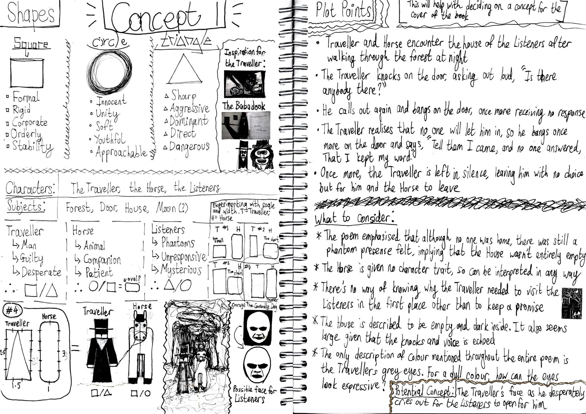
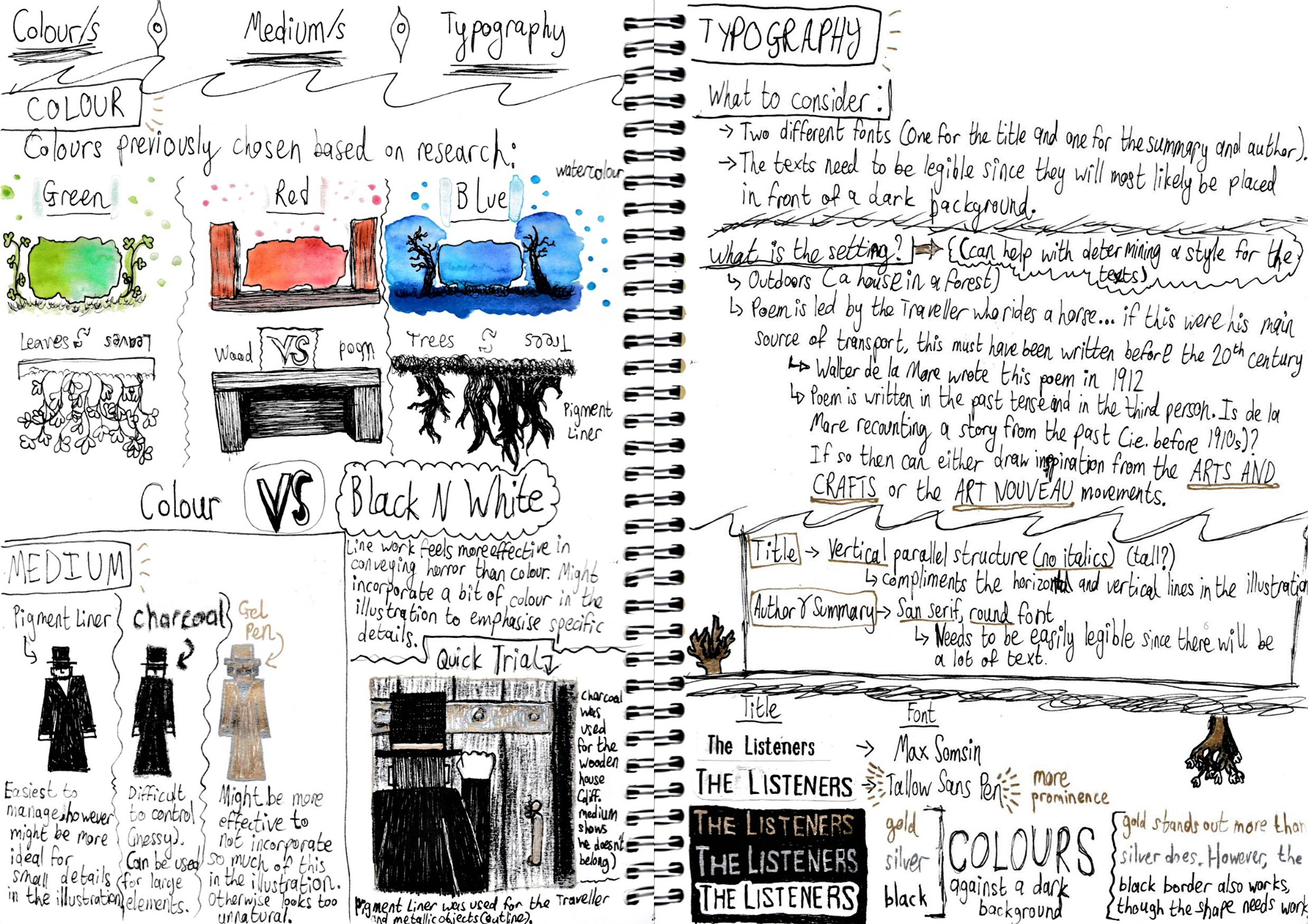
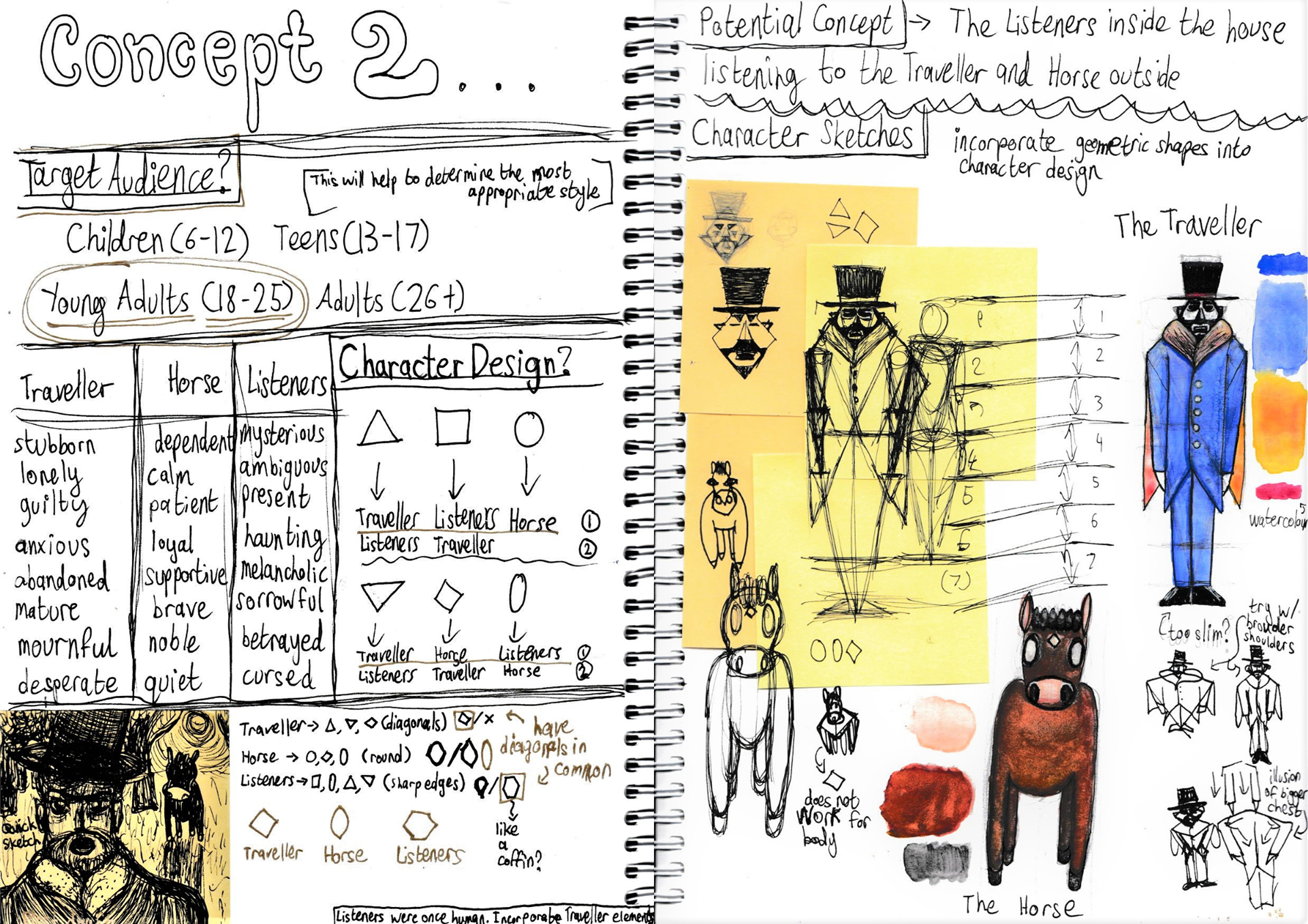
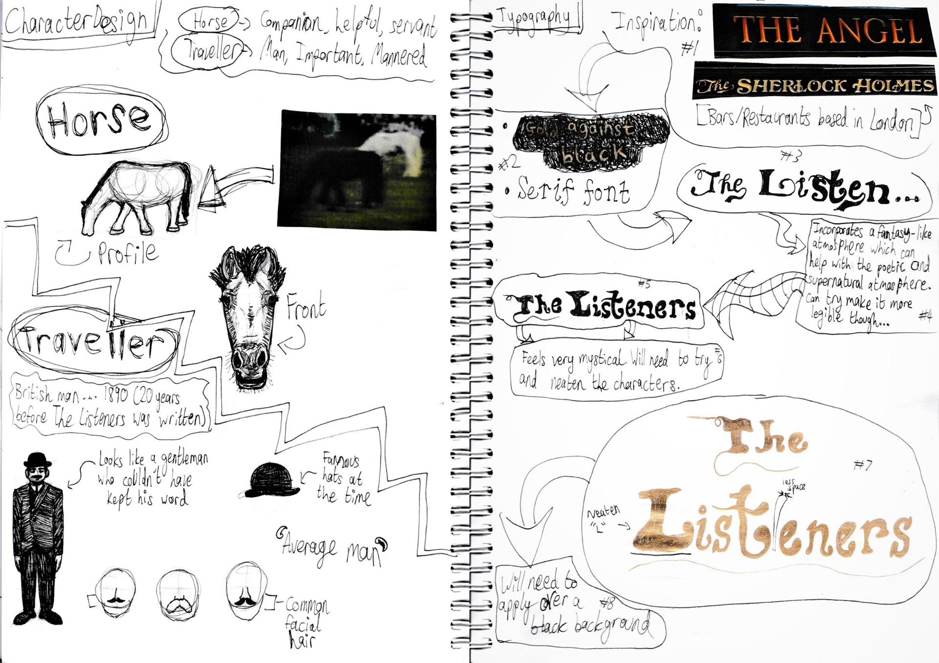
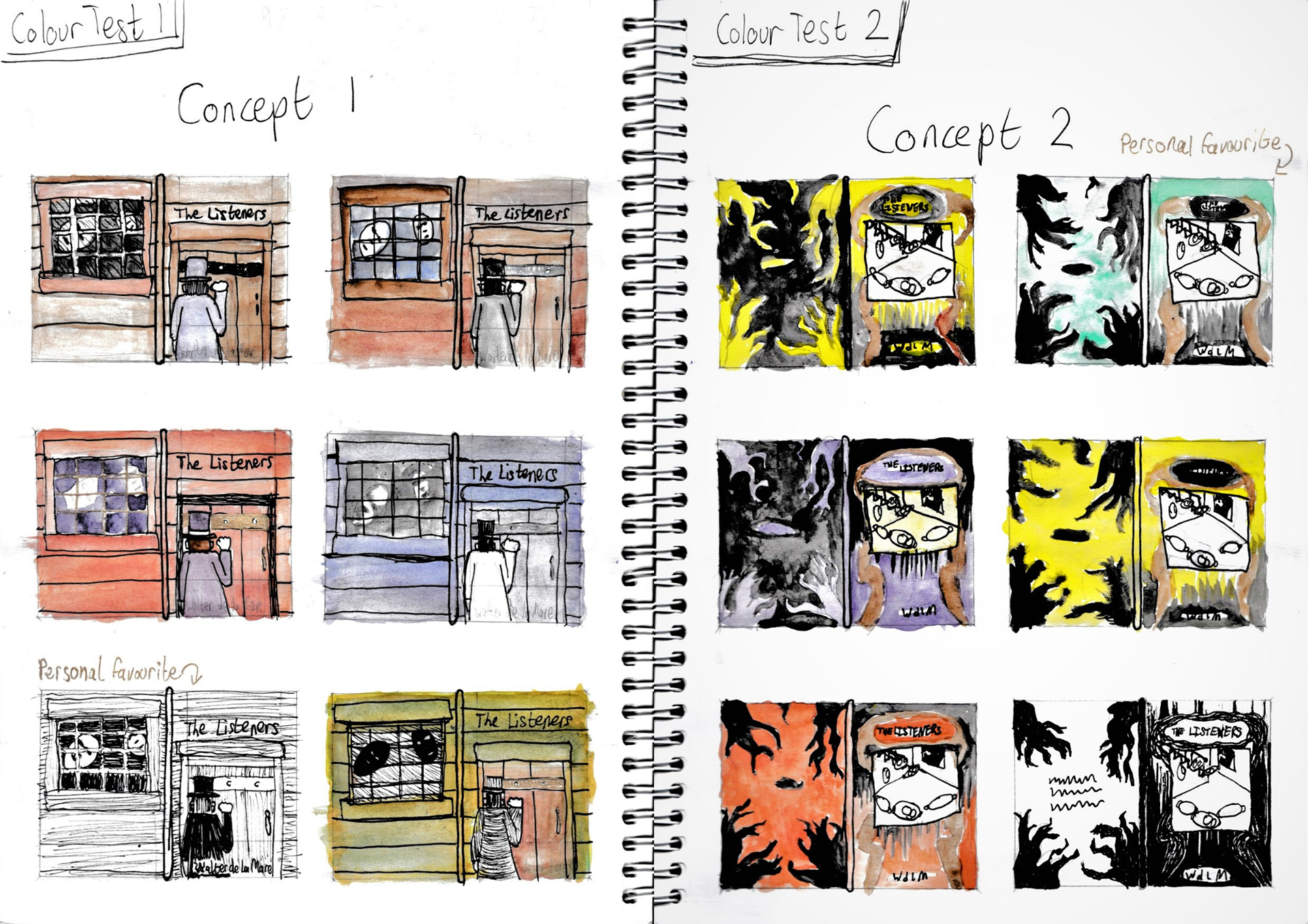
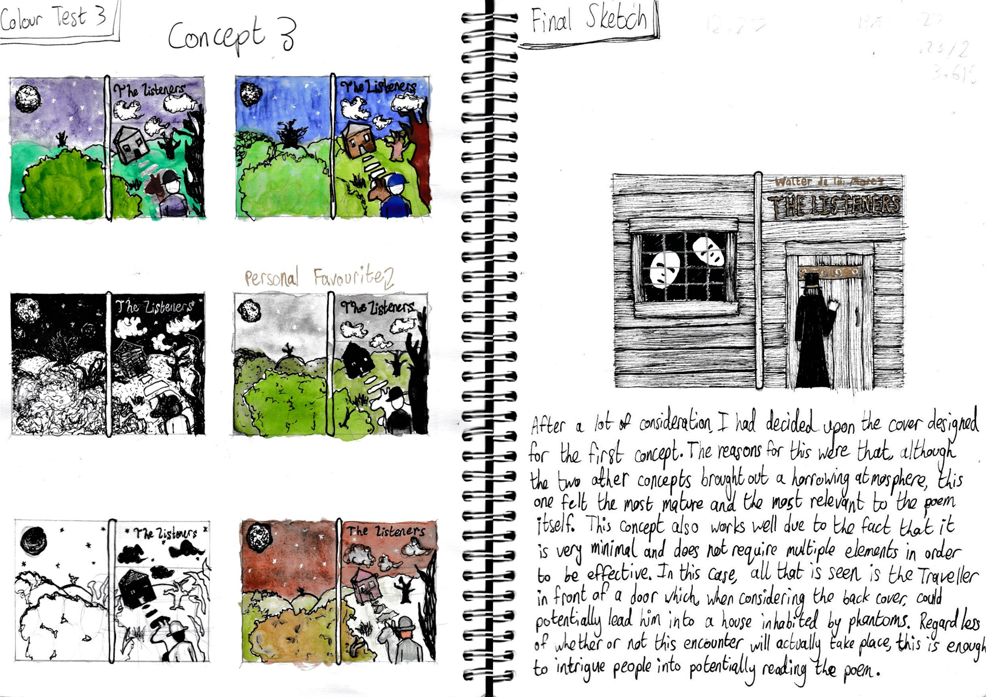
CONCEPT DEVELOPMENT
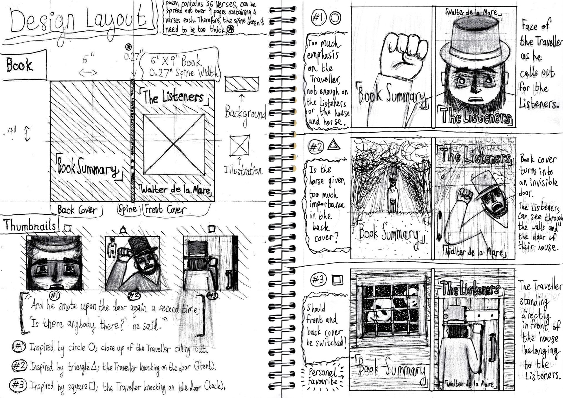
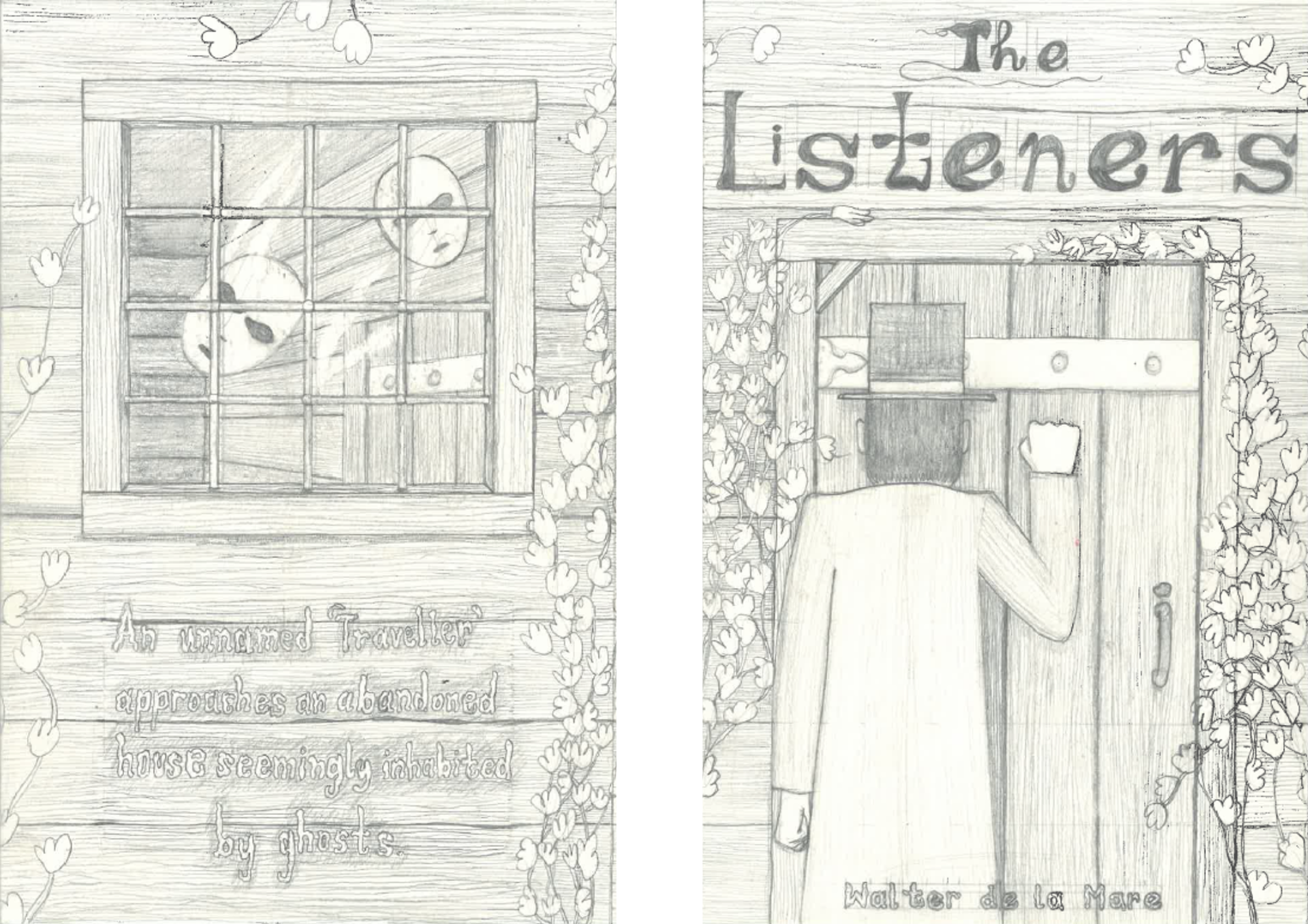
MOCKUP
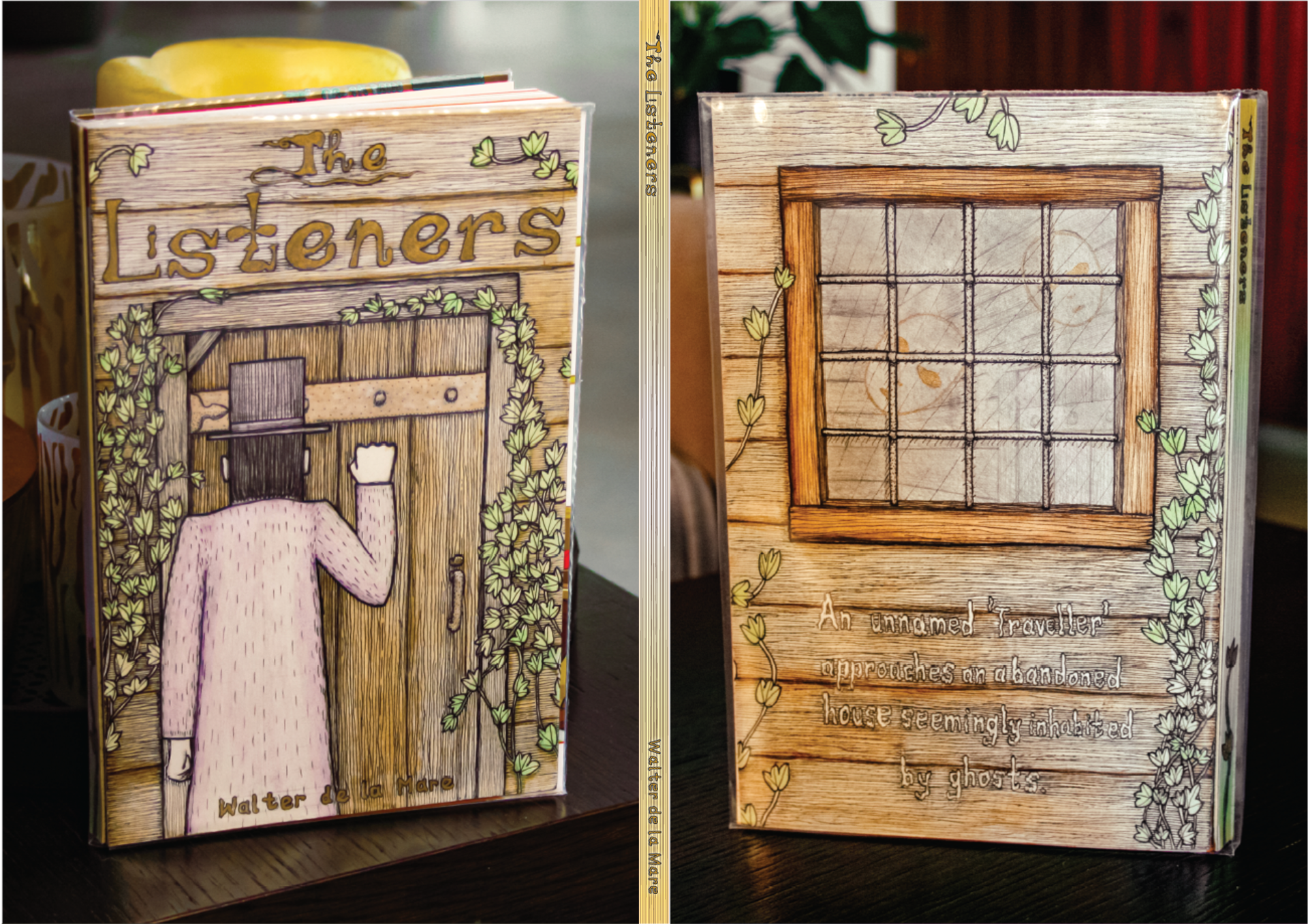
FINAL ILLUSTRATION
PERSONAL APPRAISAL
(because there's no harm in wanting to improve your craft)
~ Very detailed and in-depth research and experimentation leading up to this illustration. Very fun to revisit.
~ Terrific font style for the title, incorporating the door and Listeners' face in the typography was a fun easter egg.
~ Design font face for author name and blurb digitally to make it more consistent.
~ Fix height of spine so author name won't be cut out.
~ Love that the ivy leaves add a new character to the illustration.
~ Watercolour made this illustration feel nostalgic and homely, similar to the poem itself.
~ Was there a way to incorporate the Horse?
~ Anatomy of the Traveller's torso needs to be fixed (move slightly to the right).
~ Pencil marks still show, eg around the author name.